 TailwindCSS on Rails 02: Responsive dropdown menu
Previously we created a responsive layout: TailwindCSS on Rails 01: Responsive layout with sidebar
Now, let’s create a dropdown menu that is accessible only on mobile (small screen).
Here’s how a perfectly styled mobile menu looks on Superails.com:
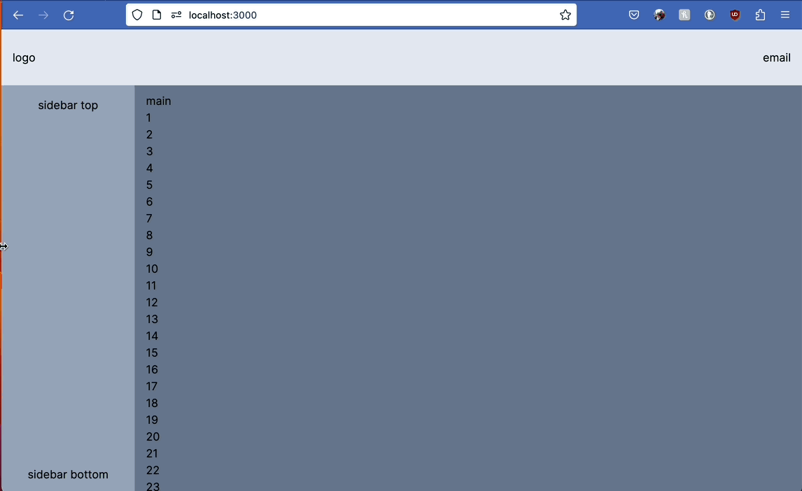
But not so fast! Here’s the mobile menu that we will build now:
First, add a generic stimulus controller to show/hide content:
// app/javasctipt/controllers/dropdown_controller.js
import { Controller } from "@hotwired/stimulus"

// Connects to data-controller="dropdown"
export default class extends Controller {
  static targets = ["content"]

  connect() {
    this.close()
  }

  toggle() {
    if (this.contentTarget.classList.contains("hidden")) {
      this.open()
    }
    else {
      this.close()
    }
  }

  open() {
    this.contentTarget.classList.remove("hidden")
  }

  close() {
    this.contentTarget.classList.add("hidden")
  }
}
Now, update the layout file from the previous post:
<!-- app/views/layouts/application.html.erb -->
<body class="bg-slate-500">
+ <div class="sticky top-0 z-10" data-controller="dropdown">
+ <nav class="bg-slate-200 p-4 flex justify-between items-center h-20">
+ <div class="">
+ logo
+ </div>
+ <div class="flex space-x-2 items-center">
+ <div class="">
+ email
+ </div>
+ <div class=" text-3xl cursor-pointer" data-action="click->dropdown#toggle" role="button">
+ ☰
+ </div>
+ </div>
+ </nav>
+ <nav class="absolute hidden bg-green-100 w-full h-80 overflow-y-auto" data-dropdown-target="content">
+ dropdown content
+ <% (200..300).each do |i| %>
+ <p><%= i%></p>
+ <% end %>
+ </nav>
+ </div>
<div class="bg-slate-300 flex">
<nav class="bg-slate-400 w-1/6 hidden md:flex flex-col text-center p-4 justify-between sticky top-20 h-[calc(100vh-80px)]">
<div>
sidebar top
</div>
<div>
sidebar bottom
</div>
</nav>
<main class="bg-slate-500 w-5/6 p-4 flex-grow">
main
<% (1..100).each do |i| %>
<p><%= i%></p>
<% end %>
<%= yield %>
</main>
</div>
</body>
Notice that the “navbar” (with logo and email) and “dropdown contant” are in the same div;
absolute class on “dropdown content”, because:
- with - dropdown OVER content
- without - dropdown pushes content down
Now the layout file is getting really big, so it makes sence to abstract navbar and sidebar into partials:
<body class="bg-slate-500">
+  <%= render 'shared/navbar' %>
  <div class="bg-slate-300 flex">
+    <%= render 'shared/sidebar' %>
    <main class="bg-slate-500 w-5/6 p-4 flex-grow">
      main
      <% (1..100).each do |i| %>
        <p><%= i%></p>
      <% end %>
      <%= yield %>
    </main>
  </div>
</body>
Advanced mode: #
Install stimulus-use
bin/importmap pin stimulus-use
- close dropdown by clicking
Escape - close dropdown by clicking outside
- close dropdown if screen size is more than
sm(768 px) - hide
<main>area and display ONLY dropdown on page - blur
<main> - disable scrolling of
<body>content
// app/javasctipt/controllers/dropdown_controller.js
import { Controller } from "@hotwired/stimulus"
// https://github.com/stimulus-use/stimulus-use/blob/main/docs/use-click-outside.md
import { useClickOutside } from 'stimulus-use'

// Connects to data-controller="dropdown"
export default class extends Controller {
  static targets = ["content"]

  connect() {
    useClickOutside(this)
  }

  clickOutside(event) {
    this.close()
  }

  closeWithKeyboard(event) {
    if (event.key === "Escape") {
      this.close()
    }
  }

  closeOnBigScreen(event) {
    if (window.innerWidth > 768) {
      this.close()
    }
  }

  toggle() {
    if (this.contentTarget.classList.contains("hidden")) {
      this.open()
    }
    else {
      this.close()
    }
  }

  open() {
    this.contentTarget.classList.remove("hidden")

    // let main = document.querySelector("main")
    // main.classList.add("blur")
    // document.body.classList.add("overflow-hidden");
    // main.classList.add("hidden")
  }

  close() {
    this.contentTarget.classList.add("hidden")

    // let main = document.querySelector("main")
    // main.classList.remove("blur")
    // document.body.classList.remove("overflow-hidden");
    // main.classList.remove("hidden")
  }
}
Update the navbar:
<!-- app/views/shared/navbar.html.erb -->
<div class="sticky top-0 z-10" data-controller="dropdown">
<nav class="bg-slate-200 p-4 flex justify-between h-20 items-center">
<div class="">
logo
</div>
<div class="flex space-x-2 items-center">
<div class="">
email
</div>
<div class="md:hidden text-3xl" data-action="click->dropdown#toggle" role="button">
☰
</div>
</div>
</nav>
<nav class="absolute hidden bg-rose-300 w-full h-40 overflow-y-auto" data-dropdown-target="content" data-action="keyup@window->dropdown#closeWithKeyboard resize@window->dropdown#closeOnBigScreen">
dropdown
<% (1..100).each do |i| %>
<p><%= i%></p>
<% end %>
</nav>
</div>
That’s it! 🤠
“Tailwind on Rails” agenda:
- Responsive layout with Navigation (header, sidebar, footer)
- Dropdown navbar menu
- Responsive Content Layout: Grid; 2-column layout; centered
- Flash message placement, styling, dismissal
- Reusable styled error messages
- Buttons and Links styling
- Responsive tables
- mobile footer navbar
- changing default scaffold templates
- Popup modal dropdowns (hide with clickoutside)
- Tabs
- Form: inputs scattered around page