 Conditional templates and Viewport for mobile browsers and native apps
Conditional templates (Request variants) #
Sometimes you will want to render completely different views on Desktop browser, Mobile browser, and Native.
Request Variants allow you to conditionally render different templates, like index.html.erb & index.html+mobile.erb.
Gem Browser helps to determine whether the browser:
bundle add browser
Set +mobile template rendering variant for both Mobile browser and Native:
# app/controllers/concerns/detect_device.rb
module DetectDevice
  extend ActiveSupport::Concern

  included do
    before_action :set_variant
  end

  private

  # inspired by
  # https://github.com/gorails-screencasts/request-variants/commit/78d72b59a0a35ce4df2de8dcb0626001bfc87a5e#diff-95144019706bb2c1ee8edff448ecc0bf5d182e3dc4faf41b2a99d753b97b2999R8
  def set_variant
    #case request.user_agent
    #when /iPhone/
    #  request.variant = :phone
    #when /iPad/
    #  request.variant = :tablet
    #end

    browser = Browser.new(request.user_agent)
    return request.variant = :mobile if turbo_native_app? || browser.device.mobile?
  end
end
Activate the DetectDevice concern:
# app/controllers/application_controller.rb
class ApplicationController < ActionController::Base
  include DetectDevice
end
Now you can render:
-
app/views/posts/index.html.erbby default -
app/views/posts/index.html+mobile.erbon mobile browsers / native apps
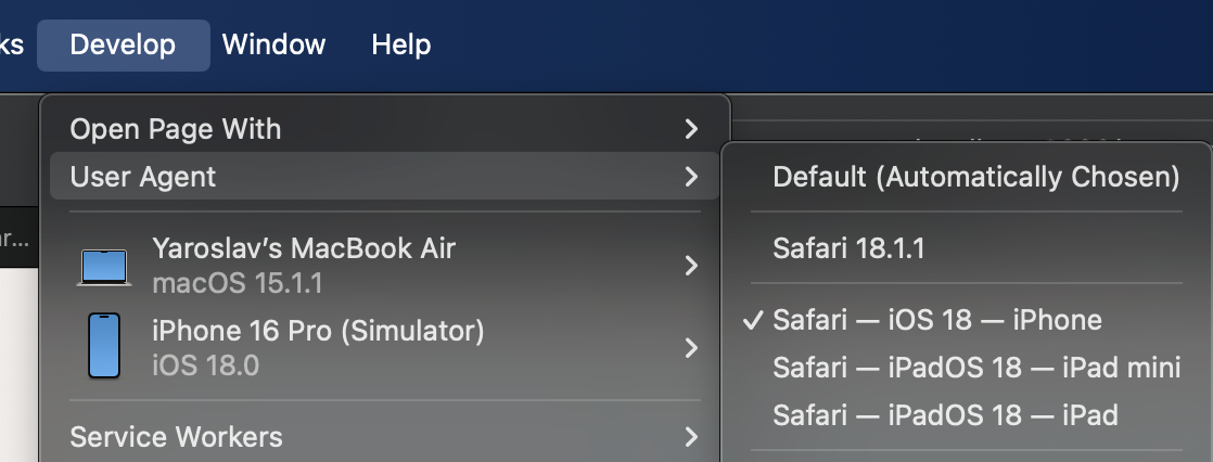
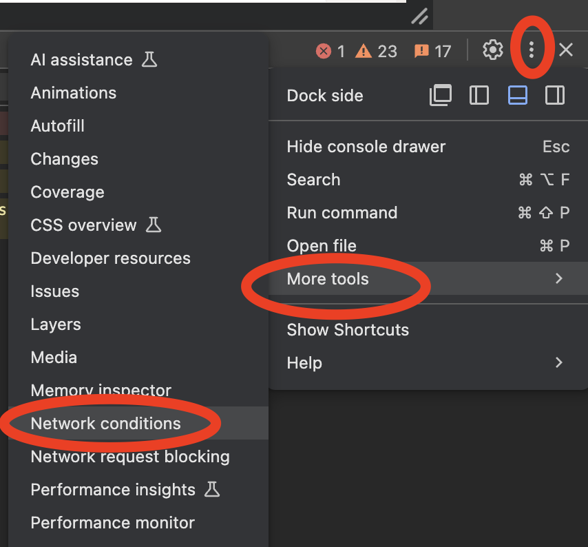
To test this, emulate user agent from your browser.
Safari:

Chromium:

Viewport scaling #
On touchscreens you will most likely want to disable zoom with fingers.
# app/helpers/application_helper.rb
  def viewport_meta_tag
    content = ['width=device-width,initial-scale=1']
    content << 'maximum-scale=1, user-scalable=0' if turbo_native_app? || browser.device.mobile?
    tag.meta(name: 'viewport', content: content.join(','))
  end
# app/views/layouts/application.html.erb
-  <meta name="viewport" content="width=device-width,initial-scale=1">
+  <%= viewport_meta_tag %>
That’s it!
Did you like this article? Did it save you some time?
