 CSS: make text on image readable
Here are some cool CSS tricks I recently did during redesigning some pages for a sports streaming service.
1. Shadow layer for contrast #
It can be tricky to make elements above an image readable. A good solution - add a semi-transparent darkness layer.
box-shadow: inset 0 0 0 100vmax rgba(0,0,0,.3); gives a perfect contrast for items above an image background. My case (left - without overlay, right - after):

The css:
<div>
  <div style="box-shadow: inset 0 0 0 100vmax rgba(0,0,0,.3); background-image: url('app/assets/images/background.png');">
    Some text above image
  </div>
</div>
Similar approach suggested on reddit
2. Easing gradients #
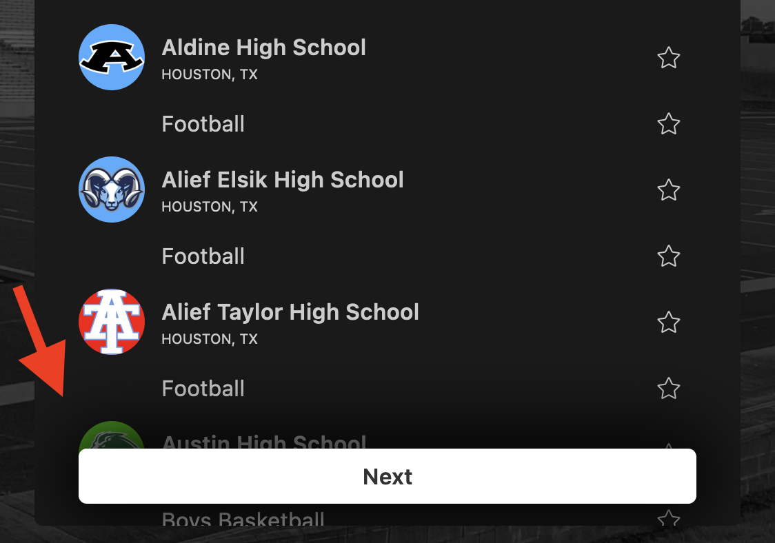
In this case, the “Next” button floats above content, and I wanted to “darken” the content behind the button. Applying a simple shadow does the trick:
The css:
<div>
  <div style='box-shadow: 0 0 50px 15px rgba(0, 0, 0, 0.9);'>
    Shadow around button
  </div>
</div>
More about easing gradients
3. Greyscale only background image #
If you just apply greyscale on a <div>, it will make all elements inside the <div> grayscale. If you don’t want to apply greyscale to anything except the main background image, here’s what you can do:

The css:
<div style="box-shadow: inset 0 0 0 100vmax rgba(0,0,0,.3); background-blend-mode: saturation; background-image: linear-gradient(black, black), url('app/assets/images/background.png');">
  <div style="color: green;">
    Green text over greyscale background image
  </div>
</div>
That’s it! 🎉🥳🍾
Did you like this article? Did it save you some time?
