 TIL: Loading animation for a Skeleton loader
When using lazy loading, you might want to add a skeleton loading animation that will repeat itself for as long as it takes.
Surely, you can do it with some existing CSS stuff like Tailwind#pulse
But on this blog, we don’t like CSS frameworks.
So let’s add something on our own!
Final result:
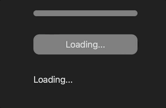
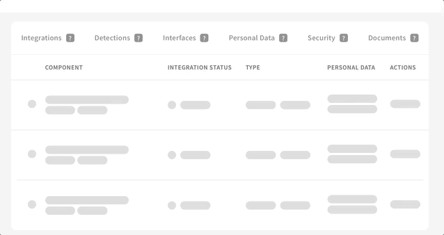
Example of the final result applied in a real application:
html
<div class="placeholder-item loader">
</div>

<div class="placeholder-item loader">
  Loading...
</div>

<div class="placeholder-item" style="width: 200px;">
  Loading...
</div>
-
loader- the grey background, has nothing to do with the animation -
placeholder-item- the loading animation
css
.loader {
  background-color: grey;
  text-align: center;
  border-radius: 12px;
  padding: 6px;
}

.placeholder-item {
  position: relative;
  overflow: hidden;
}
.placeholder-item::before {
  content: "";
  z-index: 9999;
  display: block;
  position: absolute;
  left: -150px;
  top: 0;
  height: 100%;
  width: 50px;
  background-image: linear-gradient(
    to right,
    rgba(144, 144, 144, 0),
    rgb(224, 231, 233)
  );
  animation: load 1s cubic-bezier(0.4, 0, 0.2, 1) infinite;
}
@keyframes load {
  from {
    left: -150px;
  }
  to {
    left: 100%;
  }
}
Very much inspired by Ferenc Almasi’s post
Did you like this article? Did it save you some time?
