 TailwindCSS on Rails: reusable button variants
Styling buttons with Tailwind SUCKS ⛔️ #
Applying ± the same 20x TailwindCSS classes to 1000x buttons in your app can look awful and be unmaintainable.
If you want to change the button CSS just a bit, you will have struggle updating all the places.
Styling buttons with ViewComponent SUCKS ⛔️ #
Using ViewComponents, a ButtonComponent could look more-less like ButtonComponent.new(title: "Save", icon: "plus-circle", variant: :danger, size: :2xl).
However will you also need to add all the other attributes like data, method: :patch, id="myBtn" to your new Button API!
Here’s a Polaris example of a button component.
What was a CSS problem turns into a new component with an API that you have to maintain!
Styling buttons with Bootstrap is GREAT ✅ #
Why reinvent the wheel? Boostrap Buttons have the perfect API!
Here’s how you can create some reusable styles with TailwindCSS:
/* app/assets/stylesheets/application.tailwind.css */
.link-primary {
  @apply font-semibold text-gray-300 hover:text-rose-400 active:text-rose-300;
}

.btn {
  @apply px-4 py-2 rounded-md flex items-center justify-center space-x-1 w-full font-semibold text-sm transition-colors ease-in-out duration-300;
}

.btn-secondary {
  @apply bg-gray-300 text-gray-800 focus:bg-gray-400 hover:bg-gray-400;
}

.btn-primary {
  @apply bg-blue-500 text-white focus:bg-blue-600 hover:bg-blue-600;
}

.btn-primary:disabled {
  @apply bg-blue-200 text-blue-400 cursor-not-allowed;
}

.btn-danger {
  @apply bg-red-500 text-white focus:bg-red-600 hover:bg-red-600;
}

.btn-xs {
  @apply px-3 py-1 text-xs;
}

.btn-lg {
  @apply px-6 py-3 text-lg;
}
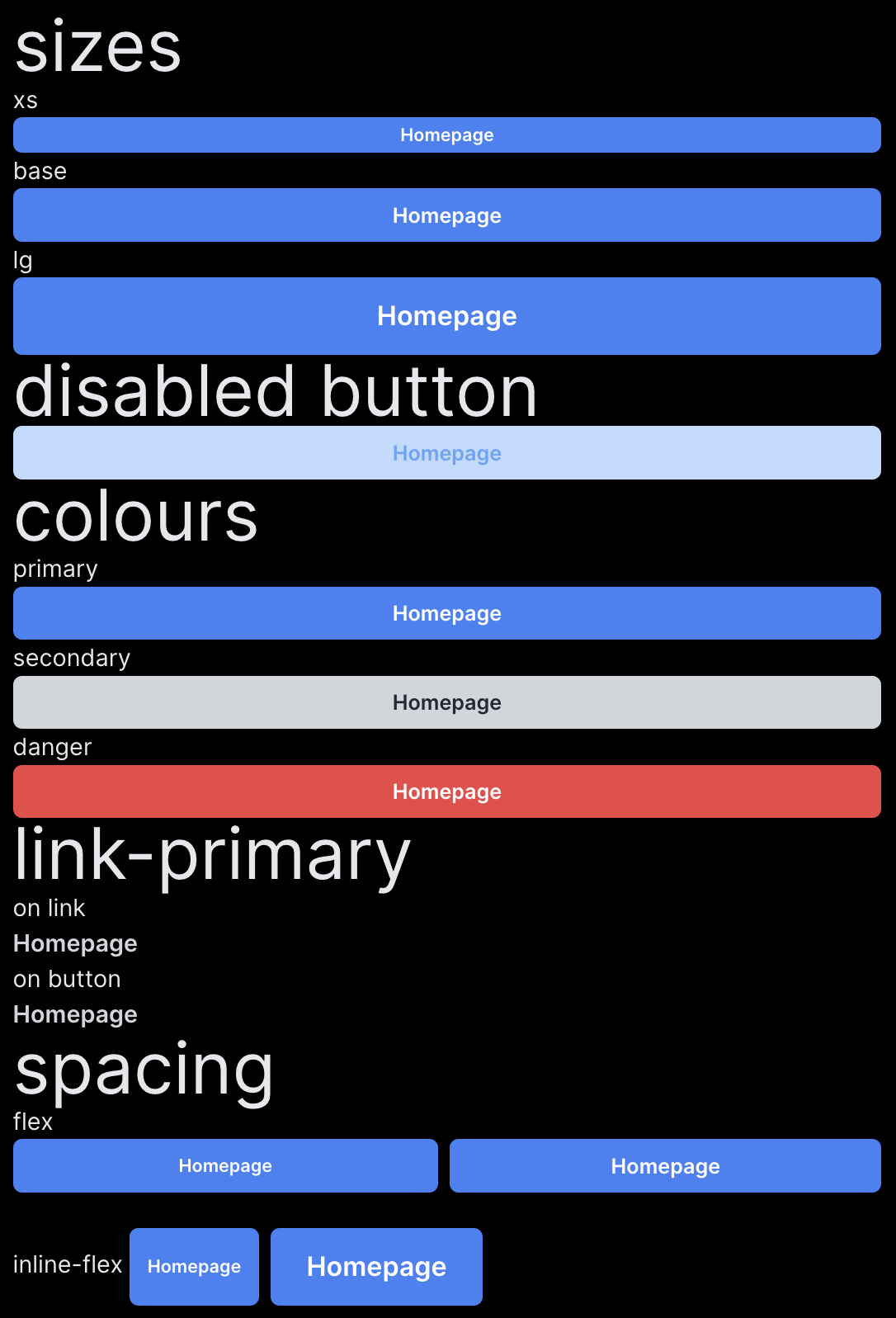
Some HTML examples:
<h2 class="text-5xl">sizes</h2>
<div class="">
  xs
  <%= link_to "Homepage", root_path, class: "btn btn-primary btn-xs" %>
  base
  <%= link_to "Homepage", root_path, class: "btn btn-primary" %>
  lg
  <%= link_to "Homepage", root_path, class: "btn btn-primary btn-lg"%>
</div>

<h2 class="text-5xl">disabled button</h2>
<%= button_to "Homepage", root_path, class: "btn btn-primary", disabled: true %>

<h2 class="text-5xl">colours</h2>
primary
<%= link_to "Homepage", root_path, class: "btn btn-primary"%>
secondary
<%= link_to "Homepage", root_path, class: "btn btn-secondary"%>
danger
<%= link_to "Homepage", root_path, class: "btn btn-danger"%>

<h2 class="text-5xl">link-primary</h2>
on link
<br>
<%= link_to "Homepage", root_path, class: "link-primary" %>
<br>
on button
<%= button_to "Homepage", root_path, class: "link-primary" %>

<h2 class="text-5xl">spacing</h2>
flex
<div class="flex gap-2">
  <%= link_to "Homepage", root_path, class: "btn btn-primary btn-xs" %>
  <%= link_to "Homepage", root_path, class: "btn btn-primary "%>
</div>

<br>

inline-flex
<div class="inline-flex gap-2">
  <%= link_to "Homepage", root_path, class: "btn btn-primary btn-xs" %>
  <%= link_to "Homepage", root_path, class: "btn btn-primary btn-lg"%>
</div>
Result:
Takeaways #
- Do not copy button styles with Tailwind all around
- Do not create a button component
- Use a bootstrap-like CSS API for buttons
Resources: #
Did you like this article? Did it save you some time?